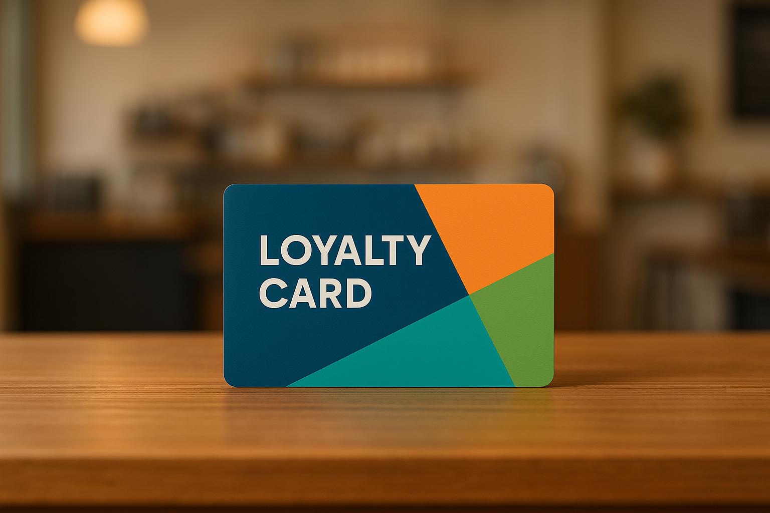
Color choices in loyalty programs matter more than you think. They influence customer emotions, decisions, and brand perception. Research shows that 85% of consumers choose brands based on color, and consistent use of colors can improve brand recognition by 80%. This guide explains how small businesses can use color psychology, accessibility principles, and modern tools to design loyalty programs that drive engagement and boost customer loyalty.
Key Takeaways:
- Color Psychology: Different colors evoke specific emotions (e.g., red = urgency, blue = trust, green = growth).
- Accessibility: Ensure designs are usable for everyone, including those with visual impairments, by using proper contrast ratios and avoiding problematic color combinations.
- Consistency: Align loyalty program colors with your brand identity across all materials.
- Modern Tools: Platforms like meed simplify color customization, ensuring uniformity across digital and physical touchpoints.
By understanding your audience and testing your designs, you can create a visually impactful loyalty program that strengthens customer connections and boosts repeat business.
How To Use Color Psychology In Marketing And Branding (Choose Your Brand Colors)
How Colors Affect Customer Behavior in Loyalty Programs
Understanding how colors influence customer psychology can make a huge difference when designing loyalty programs that resonate with your audience. Colors have the power to evoke emotions and shape perceptions, which directly impacts customer engagement. This section dives into how specific hues can influence emotions and behaviors, offering insights for practical application.
Color Psychology: Building Emotional Connections
Each color stirs up unique emotional responses, and choosing the right ones can make your loyalty program more impactful.
- Red sparks urgency and excitement, making it perfect for limited-time offers. Nintendo uses red to channel energy and passion, while Coca-Cola taps into its vibrant nature to encourage consumption and align with its branding.
- Blue conveys trust and dependability, essential for fostering long-term customer relationships. Brands like Muscle & Strength use blue to build confidence and reassure customers about data security and professionalism.
- Yellow brings happiness and optimism, creating a cheerful vibe. McDonald’s uses yellow to evoke a sense of youthfulness and positivity, which helps boost engagement.
- Green symbolizes health, safety, and growth. Vegetable and Butcher incorporate green into their branding to appeal to wellness-focused customers and emphasize environmental awareness.
- Purple suggests luxury and creativity. Spectrum, a cosmetics brand, uses bold purple tones to stand out and attract younger, forward-thinking consumers.
- Monochrome palettes (black, white, and silver) exude timeless sophistication. StriVectin uses these tones to create a clean, refined look that resonates with customers seeking elegance and purity.
Research backs up the significance of color: 85% of consumers say color significantly influences their purchase decisions. Additionally, consistent use of color across all loyalty program touchpoints increases brand recognition by 80%.
Making Colors Accessible for All Customers
An inclusive approach to color ensures your loyalty program is accessible to everyone, including those with color blindness – a condition that affects about 1 in 12 men and 1 in 200 women globally. Accessibility isn’t just about compliance; it’s a smart way to broaden your audience.
To improve accessibility, ensure proper color contrast ratios. Aim for at least 4.5:1 for normal text and 3:1 for larger text. For enhanced accessibility, many standards recommend 7:1 for normal text and 4.5:1 for larger text. Tools like the WebAIM Contrast Checker or Color Contrast Analyzer can help you meet these standards.
Avoid problematic combinations like red with green or blue with gray, as these can confuse users with color blindness. To ensure clarity, supplement color cues with icons or text.
"If color is the only way you’re conveying meaning – like using red for errors and green for success – users with color blindness might not understand your design at all. Accessibility ensures the experience works for everyone."
– Becky Kinkead, Marketing Design and UX Manager at Litmus
The business case for accessibility is clear. Americans with disabilities collectively control $21 billion in disposable income annually, making accessibility both a moral and strategic priority. As Lauren Castady from Oracle Digital Experience Agency explains:
"We’re not just making something accessible to feel good about ourselves… We’re focusing on accessibility because users with disabilities won’t spend money with companies that ignore these best practices. The performance difference is real."
– Lauren Castady, Oracle Digital Experience Agency
| Type of Color Blindness | What It Affects | Impact on Loyalty Programs |
|---|---|---|
| Protanopia | Difficulty seeing red light | Red elements may appear brown or dark gray |
| Deuteranopia | Difficulty seeing green light | Red and green elements may blend together |
| Tritanopia | Difficulty seeing blue/yellow | Blue may appear greenish; yellow can fade |
Once accessibility is addressed, you can focus on how these colors connect with US consumers.
Color Meanings in US Markets
Colors not only evoke emotions but also carry specific cultural meanings in the US. For example, red conveys urgency and excitement, making it ideal for flash sales or limited-time bonus offers. Blue, on the other hand, represents trust and stability, which are highly valued in financial transactions and data security.
Green resonates with themes of health, growth, and eco-consciousness, appealing to consumers who prioritize sustainability. Demographics also play a role – bold colors like purple are more likely to attract younger audiences, while older consumers may prefer the sophistication of monochrome palettes like StriVectin’s.
Seasonal adjustments can also enhance engagement. For instance, incorporating red, white, and blue for July 4th promotions or warm tones for fall campaigns can keep your loyalty program feeling fresh and relevant. Testing different combinations is key to finding what resonates most with your audience.
Ultimately, your color choices should align naturally with your brand’s personality. When done right, colors help foster emotional connections that drive engagement and build lasting loyalty.
How to Design and Set Up Custom Color Schemes
Creating a well-thought-out color scheme for your loyalty program is about more than just aesthetics – it’s about reinforcing your brand and delivering a seamless customer experience. This section explains the key components of a color scheme, how to apply your brand colors consistently, and tips for keeping your design both functional and visually appealing.
Parts of a Color Scheme
A solid color scheme is made up of three main components: primary, secondary, and accent colors. Each plays a unique role in balancing the design and guiding customer focus.
- Primary Color: This is the core color that represents your brand’s identity. It should dominate your loyalty program, covering about 60% of the interface. Use it for backgrounds, main headers, and other foundational elements that customers will associate most closely with your program.
- Secondary Color: This complements the primary color, providing contrast and variety. Ideally, it covers around 30% of your design and is used for navigation menus, secondary buttons, or supporting visuals. It should enhance the primary color without overpowering it.
- Accent Colors: These are your attention-grabbers, used sparingly (about 10% of your palette) to highlight critical actions like "Join Now" buttons, special offers, or notifications. Their purpose is to draw attention to specific elements without overwhelming the overall design.
When choosing your colors, it’s important to test how they appear on different devices and under varying lighting conditions. Colors can look different depending on the screen or environment, so testing ensures consistency and usability.
Using Brand Colors Across All Program Materials
Once you’ve defined your primary, secondary, and accent colors, the next step is to apply them consistently across every aspect of your loyalty program. This includes everything from digital stamp cards and QR codes to mobile wallet passes, email notifications, and in-store displays. Consistent use of color codes (like HEX or RGB) builds trust and ensures that your materials look professional and cohesive.
Modern loyalty platforms simplify this process with global color settings. These tools allow you to update colors across all program elements at once, saving time and eliminating inconsistencies. For example, if you adjust the color of your primary buttons, the change will automatically reflect on digital cards, QR codes, and wallet passes.
Preview features on these platforms let you see how your color choices will appear before they go live. This ensures your design decisions work well together and prevents errors that could disrupt the customer experience.
Take meed’s custom branding features as an example. They allow businesses to easily manage color schemes across all program elements, from digital stamp cards to QR code rewards. This centralized system ensures everything stays aligned while still offering the flexibility to adapt for special promotions or seasonal campaigns.
Keeping Colors Easy to Use and Attractive
Design isn’t just about looking good; it also needs to function well. To maintain usability, ensure high contrast between text and background colors. For instance, dark text on a light background – or vice versa – makes content easier to read across different devices and lighting conditions.
Stick to your established color scheme to avoid confusion. A cluttered or inconsistent palette can make your program feel unorganized and dilute your brand identity. Interactive elements like buttons and links should stand out clearly, using both color and contrast to signal their functionality. Customers should instantly recognize what they can click or tap without any guesswork – this is especially important for users on smaller screens or those who may have difficulty distinguishing colors.
Regular user testing can help uncover any issues with your color scheme. Feedback from real customers using your program on various devices and in different environments can reveal problems you might not notice during design. Simple surveys or usability tests can go a long way in ensuring your design works for everyone.
Lastly, remember that your color scheme isn’t set in stone. Over time, you may need to adjust it for seasonal promotions, new product launches, or brand updates. By choosing a flexible system, you can make these changes without overhauling your entire design. This adaptability helps maintain customer trust and ensures your program stays relevant as your business grows.
sbb-itb-94e1183
Tools and Platforms for Color Customization
Choosing the right platform for color customization can turn branding into a strategic advantage. Modern loyalty program software makes it easy to achieve professional branding results without requiring coding skills.
How Software Solutions Simplify Color Customization
In the past, creating custom color schemes often required designers or complex tools. Today, loyalty platforms have made this process much more accessible. With visual editors, you can preview changes instantly and adjust colors with just a few clicks.
The best platforms go beyond basic tools, offering advanced branding options. These include full control over colors, fonts, and CSS styling, allowing you to create a cohesive and polished look for your loyalty program. This ensures your program not only matches your brand’s colors but also feels like a seamless part of your business.
Many platforms also support integration with marketing systems through APIs. This means you can maintain consistent color schemes across emails, mobile wallet passes, and physical locations. When customers experience the same branding across all touchpoints, it builds trust and reinforces brand recognition.
Next, let’s see how meed’s platform takes these features to the next level.
meed‘s Custom Branding Features
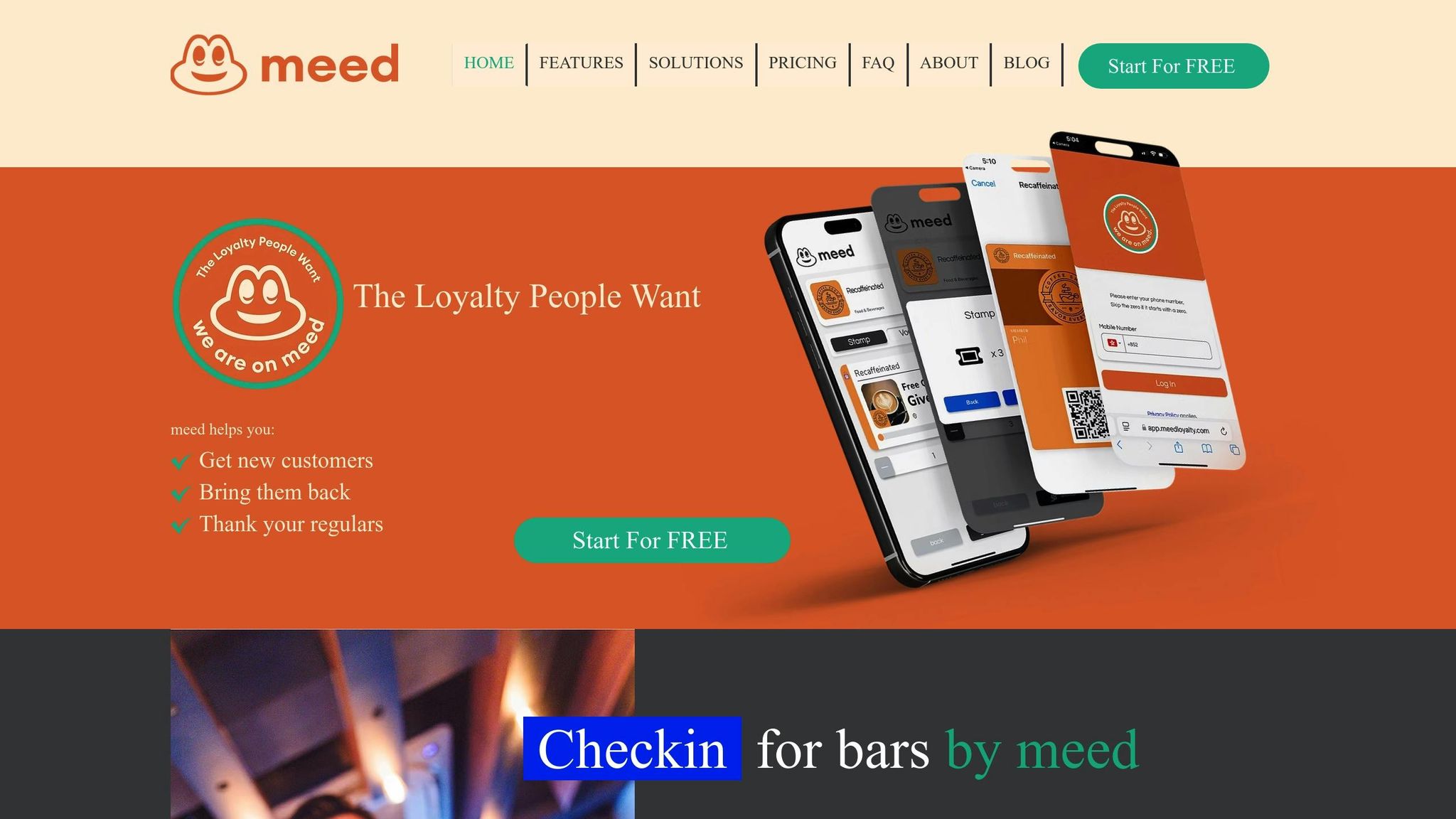
meed stands out by offering advanced tools for centralized branding and automatic syncing across all program elements. Businesses can customize colors, shapes, and icon sizes across their loyalty program, from digital stamp cards to QR code rewards, ensuring every detail aligns with their brand.
Global color settings simplify the process further. Instead of updating each element individually, changes automatically apply across digital stamp cards, QR codes, and integrations with Apple Wallet and Google Wallet. This approach ensures a consistent, cohesive brand experience.
For businesses operating in multiple regions, meed supports multi-language and multi-currency options. This ensures that your brand colors remain consistent, whether customers view your program in English, Spanish, or any other supported language. It’s a crucial feature for companies serving diverse audiences or expanding internationally.
Additionally, meed’s platform allows for tailored color coding to differentiate campaigns. For instance, you can use distinct colors for actions like writing reviews, following your brand on social media, or celebrating customer birthdays. Redemption options – such as free products, exclusive access, or free shipping – can also feature unique colors while maintaining overall brand harmony.
Once your design is in place, analytics tools ensure your color choices are working effectively.
Measuring the Impact of Your Color Choices
Modern platforms make it easy to measure how well your color choices are performing. Analytics and reporting tools provide insights into key metrics like repeat purchase rates, average order value, and purchase frequency.
A/B testing is especially useful for refining color schemes. For example, you can test whether red or blue call-to-action buttons drive more engagement. This data-driven approach helps identify which designs resonate most with your audience.
Track specific KPIs tied to your color choices, such as enrollment rates, reward redemption rates, repeat purchase rates, and customer lifetime value (CLV). Use these insights to adjust your approach if performance shifts.
With 60% of brands expected to prioritize CLV by 2025 and 58% planning to increase investments in loyalty strategies, thoughtful color choices can play a key role in driving engagement. Regular testing of elements like earning rules, reward displays, and promotional messaging colors ensures your program not only looks great but also supports your business goals in measurable ways.
Benefits and Drawbacks of Custom Color Schemes
Custom color schemes can take your loyalty program to the next level, but they come with both upsides and challenges. Let’s dive into the specific advantages and potential pitfalls of tailoring your program’s colors.
Benefits of Custom Color Schemes
Stronger Brand Recognition and Trust
Using custom colors ties your loyalty program directly to your brand, creating a seamless and recognizable experience. When customers see your brand colors throughout the program, it strengthens their connection to your business. This consistency builds trust and reinforces your brand identity at every interaction. In fact, studies show that up to 90% of snap purchase decisions are influenced by a brand’s appearance.
Enhanced Customer Experience
The right colors do more than look good – they guide users, highlight key rewards, and create emotional connections. A visually appealing program that’s easy to navigate keeps customers engaged and makes them more likely to return. When customers associate your colors with positive experiences, they’ll not only stay loyal but may also recommend your business to others.
Improved Program Performance
Strategic use of your brand colors can significantly boost results. For example, personalized offers that incorporate your brand’s colors can perform up to three times better than generic promotions, leading to noticeable increases in membership.
Competitive Differentiation
In a crowded marketplace, a unique color palette can make your loyalty program stand out. When customers compare options, a memorable visual identity can give your program an edge.
Common Problems and How to Fix Them
Negative Associations
Colors can evoke unintended emotions or memories that might not align with your brand. Since color perception is highly personal, it’s easy to misstep and alienate your audience.
Solution: Ensure your chosen colors reflect your brand’s personality and values.
Misaligned Branding
Attractive colors don’t always mean they’re the right fit for your brand. If your color choices clash with your brand identity or fail to meet customer expectations, it can confuse your audience and weaken recognition.
Solution: Carefully align your color scheme with your brand’s personality and the preferences of your target audience.
Pros and Cons Comparison Table
Here’s a quick overview of the advantages and challenges to consider when customizing your program’s colors:
| Advantages | Disadvantages |
|---|---|
| Stronger brand recognition | Potential negative associations |
| Enhanced customer experience | Misaligned branding risks |
| Higher conversion rates | |
| Competitive differentiation |
To make the most of your custom color scheme, focus on understanding your audience, testing your designs, and maintaining consistency across all platforms. With thoughtful planning and refinement, your loyalty program can stand out and drive meaningful results.
Key Points and Next Steps
Summary of Main Points
Choosing the right colors plays a key role in the success of loyalty programs. A well-thought-out visual design can significantly enhance customer engagement. From digital stamp cards to reward notifications, a consistent color scheme builds trust and makes your program instantly recognizable. In fact, research shows that maintaining a consistent brand presentation can boost revenue by up to 20%.
Equally important is ensuring your color palette is accessible to everyone, including those with visual impairments or color blindness. Accessibility and consistency should guide every decision. Tools like meed’s custom branding features simplify the process, allowing businesses to create professional-quality designs without needing advanced design skills.
Now, let’s dive into actionable steps to bring your custom color strategy to life.
Step-by-Step Guide for Small Businesses
Start with your existing brand colors.
Leverage your current brand colors as the foundation for your loyalty program. This ensures immediate recognition and reinforces your brand identity across all channels.
Customize every element to match your brand.
Think beyond digital – physical materials like loyalty cards or promotional items should also align with your brand’s visual identity.
Train your team.
Make sure your employees fully understand the program, including its terms and the reasoning behind your color choices. This knowledge helps them confidently present the program to customers and maintain consistency.
Monitor and adjust.
Track key metrics like enrollment rates, engagement levels, and customer feedback from day one. Use this data to refine your program and ensure your color choices resonate with your audience.
These steps will help you create a visually cohesive loyalty program that strengthens customer connections.
Tips for Testing and Improving Your Colors
Once you’ve established your color scheme, fine-tune it using these testing strategies. A/B testing is a powerful way to evaluate how well your colors perform across different platforms.
For example, test key elements like signup pages or reward notifications with varying color schemes. Joshua Porter’s experiment with two identical landing pages – one featuring a green call-to-action button and the other a red one – showed that the red button drove 21% more conversions.
"Color and contrast show relationships between items, establish the importance, and most importantly draw attention."
- Jennifer Fleming, Author of Web Navigation: Designing the User Experience
Gather direct feedback from customers through surveys or focus groups. Ask how the colors make them feel and whether they align with your brand’s message. This qualitative data complements your A/B testing results.
Also, test your designs across different devices and platforms. Colors can appear differently on a desktop versus a mobile screen, so this step ensures your visuals remain consistent and appealing no matter where they’re viewed.
To minimize risks, start with mock-ups or limited rollouts to a small group of customers. This approach lets you identify and address potential issues before launching changes program-wide. Keep in mind that color preferences can vary among different audience segments, so ongoing testing and tweaks are essential to long-term success.
FAQs
How can I make my loyalty program’s color scheme accessible for people with color blindness?
When designing a color scheme that works for individuals with color blindness, it’s essential to use high-contrast colors and avoid depending only on color to communicate information. Incorporating symbols, patterns, or text labels alongside colors can help ensure your design is clear and functional for everyone.
To refine your design, try using color blindness simulators to spot any potential challenges and adjust accordingly. By keeping accessibility in mind, you can create a more inclusive and user-friendly experience for all.
How can I test and improve the color choices in my loyalty program to boost customer engagement?
To fine-tune the color scheme of your loyalty program and boost customer engagement, start with A/B testing. This approach lets you test different color combinations to see which ones click best with your audience. Pay close attention to customer behavior and feedback to uncover trends and preferences.
Take it a step further by mapping out the customer journey. Identify the key moments where color choices can have the greatest influence – whether it’s during sign-ups, rewards notifications, or checkout. Use the insights you gather to align your color palette with your brand’s identity and what appeals most to your audience. Regular updates and a touch of personalization can keep your program visually appealing and relevant, helping to build stronger connections with your customers.
How can I match my loyalty program’s colors to my brand while keeping them adaptable for seasonal promotions?
To make sure your loyalty program’s colors align seamlessly with your brand, start by choosing a core color palette that reflects your brand’s identity and values. For example, blue might evoke trust, while green can convey a sense of reliability. This core palette will act as the anchor for visual consistency.
When running seasonal promotions, you can add seasonal accents or temporary color overlays that work well with your primary colors. Think warm shades like oranges and browns for fall, or soft pastels for spring. This approach keeps your loyalty program visually appealing and timely, while still staying true to your brand’s overall aesthetic.