Super app loyalty programs often fail due to poor user interface (UI) design. Why? Users struggle with slow loading times, confusing navigation, and a lack of personalization – all of which discourage engagement and reduce the program’s effectiveness.
Here’s what usually goes wrong:
- Performance Issues: Sluggish load times caused by unoptimized images, server delays, and excessive data requests.
- Confusing Navigation: Users can’t easily find rewards, track points, or redeem benefits.
- Generic Experiences: One-size-fits-all content ignores user preferences, making interactions less relevant.
- Accessibility Gaps: Many programs overlook features that ensure usability for all, like proper contrast or keyboard navigation.
Fixing these problems involves practical solutions:
- Use skeleton screens and lazy loading to speed up performance.
- Simplify navigation with clear layouts and shortcuts, ensuring key features are within three taps.
- Personalize dashboards and notifications based on user behavior.
- Follow accessibility standards, like WCAG, to make programs usable for everyone.
Making your app feel faster than it really is
Common UI Problems in Super App Loyalty Programs
Loyalty programs within super apps often encounter recurring UI challenges that frustrate users and limit their effectiveness. Tackling these issues head-on is essential to improving user experience and boosting participation.
Slow Loading and Poor Performance
Performance hiccups can significantly disrupt user engagement. Imagine tapping on the loyalty section, only to wait several seconds for your points balance to load – many users would simply give up. These delays often stem from inefficient coding practices and memory leaks, which put unnecessary strain on device resources.
Heavy assets, like unoptimized images and large files, along with network bottlenecks, are major culprits behind sluggish performance. Factors such as high latency, weak cellular signals, and limited bandwidth exacerbate the problem, especially when multiple server requests are needed to display rewards or transaction histories. On top of that, slow server responses and poorly optimized database queries add to the frustration.
But performance isn’t the only issue – navigational hurdles also play a big role in disengaging users.
Confusing Navigation and User Flows
Poor navigation design can make loyalty programs feel like a maze. Users often struggle to find their points balance, understand redemption options, or track their progress toward rewards. This confusion leads to program abandonment and lower participation rates.
Redemption processes are another pain point. When users face unclear information about their points balance or vague instructions on how to redeem rewards, they’re less likely to follow through. Delays in communicating earned rewards further discourage engagement, creating bottlenecks that prevent members from advancing through program tiers. In 2023, global redemption rates for loyalty rewards hovered at just 49.8%.
Beyond navigation, the lack of tailored experiences further weakens user interest.
Generic Content and Lack of Personalization
A one-size-fits-all approach to content can alienate users. For instance, treating a frequent food delivery customer the same as someone who primarily uses ride-sharing services misses the chance to create meaningful, relevant interactions. This lack of tailored experiences often leaves users feeling disconnected. Additionally, restrictive earning rules and rigid user experiences further discourage engagement.
How to Fix UI Issues in Loyalty Programs
Tackling UI issues in loyalty programs requires practical strategies that improve every aspect of the user experience. Here are some actionable ways to turn frustrating interfaces into smooth, user-friendly interactions.
Boosting Performance and Speed
Speed is everything when it comes to user satisfaction. To minimize delays, you can use skeleton screens – these placeholders give users the impression that content is loading, reducing perceived wait times. Pair this with lazy loading, which loads content like reward catalogs or transaction histories only when users scroll to them.
For images, opt for compressed formats like WebP. These keep file sizes small while maintaining quality. And don’t forget animations – keep them simple and smooth, running at around 60 FPS. Overly complex transitions can drag down performance, especially on older devices, so stick to basic fade-ins or slides.
Simplifying Navigation Patterns
A predictable, straightforward navigation flow is essential. Users should easily locate key features like point balances, rewards, and redemption options. A good rule of thumb? Make sure any major function is no more than three taps away from the main screen.
You can also streamline the experience by adding contextual shortcuts. For instance, when users view a reward, include a direct option to redeem it. Similarly, show relevant earning opportunities based on their current activity. Regular user testing is key to identifying and fixing navigation pain points.
Improving Visual Design and Layout
A well-thought-out layout can make or break the user experience. Dynamic arrangements that adapt to user behavior are particularly effective. For example, if someone frequently orders food, prioritize restaurant rewards on their dashboard. This keeps the interface relevant and reduces mental effort.
Establish a clear visual hierarchy to guide attention. Use bold fonts for critical information like point balances, contrasting colors for call-to-action buttons, and plenty of whitespace to avoid clutter. Seasonal updates – like new color schemes or refreshed banners – can keep the design engaging without requiring a full redesign.
Consistency is also crucial. Stick to a uniform color palette, typography, and overall style across all touchpoints, from the app to email notifications. This reinforces the program’s identity and creates a seamless experience.
Adding Personalization Features
Personalization can transform a generic loyalty program into a tailored experience. Use behavior-driven recommendations based on purchase history and engagement patterns. For example, highlight café rewards for coffee lovers or ride-related offers for frequent commuters.
Smart notifications are another must-have. Send timely updates about point balances, upcoming reward expirations, or personalized deals – just be careful not to overwhelm users with too many alerts.
Customizable dashboards are a great way to let users take control. Some might prefer to see their point balance front and center, while others may want to focus on progress toward specific rewards. Offering these options boosts satisfaction and engagement.
Finally, adapt the content based on a user’s journey within the program. New members might benefit from onboarding tips and clear earning opportunities, while long-time users may appreciate exclusive rewards and tier benefits.
Making Programs More Accessible
Accessibility isn’t optional – it’s essential. Following WCAG guidelines ensures that everyone, including those with disabilities, can use the program. This means maintaining adequate color contrast (e.g., at least 4.5:1 for normal text), adding alternative text for images, and making all interactive elements accessible via keyboard.
Responsive typography is another helpful feature. Using relative units like em or rem allows text and layouts to scale smoothly across different devices and user settings.
Clear iconography is equally important. Pair icons with text labels, stick to universally recognized symbols, and maintain consistency throughout the interface to make navigation easier.
For more complex information, use progressive disclosure. Instead of overwhelming users with lengthy terms and conditions, present details gradually through expandable sections or step-by-step explanations. This keeps the interface clean and digestible.
Platforms like meed offer pre-built loyalty program components designed to address these challenges. Features like digital stamp cards and QR code rewards integrate seamlessly with Apple and Google wallets, making it easier to deliver a streamlined, accessible experience.
sbb-itb-94e1183
Creating a Design System for Loyalty Program UI
A well-organized design system is key to creating a seamless experience for users checking points, browsing rewards, or tracking their tier progress. This is especially important in super apps, where loyalty programs often span multiple services and touchpoints. Without a unified system, inconsistencies can creep in, confusing users and diluting the brand’s identity. By taking a systematic approach, you can scale your design efficiently while ensuring a polished, engaging experience. Let’s dive into how standardized components and consistent design tokens can make UI development smoother.
Building Reusable Loyalty Components
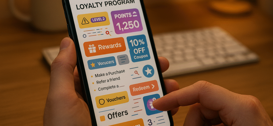
Reusable components are the backbone of an efficient design system. Start by identifying the essential elements of your loyalty program: reward cards, point counters, tier progress bars, loyalty stamp trackers, and redemption buttons.
For reward cards, consistency is crucial. Whether the reward is a coffee discount or a ride credit, the layout, typography, and spacing should remain uniform. This makes it easier for users to quickly scan and compare options without having to adjust to different designs.
Progress indicators also play a significant role. A well-designed progress bar can serve multiple purposes – tracking tier advancement, stamp collection, or challenge completion. Flexibility here ensures the component can adapt across various scenarios.
Point displays are another critical element, as they’re often the first thing users notice. Create a standardized format for showing the current balance, recent changes, and expiration dates. Whether this component appears in a dashboard widget, transaction history, or checkout screen, it should function seamlessly.
Action buttons, like the "Redeem" button, should maintain a consistent look and feel across all contexts. Whether users encounter it on a reward card, in their shopping cart, or during checkout, the button should behave predictably to reduce friction.
Keeping Design Consistent Across Features
Consistency becomes a challenge when multiple teams are involved in developing different parts of a loyalty program. One way to address this is by using design tokens – a shared system for colors, fonts, spacing, and animations that ensures a unified interface.
Versioned design tokens allow you to make updates across all touchpoints effortlessly. For example, a change in color or font can propagate automatically, keeping the design aligned everywhere.
Establish clear cross-team guidelines to handle deviations from standard components. While customization might be necessary in some cases, it should be intentional and well-documented. Regular design reviews can help catch inconsistencies before they reach users.
Comprehensive documentation is another must-have. Your design system should include not just visual specs but also guidelines for usage, interaction patterns, and accessibility. This ensures that any new feature feels like a natural extension of the existing experience.
Finally, treat your component libraries as evolving resources. As user needs and use cases change, update your components and share these improvements across teams to keep the design system relevant and effective.
Testing and Monitoring UI Quality
Testing is essential to ensure your design system delivers a smooth user experience. Start with usability tests to uncover hidden pain points and areas for improvement.
Automated audits can monitor load times, accessibility, and visual consistency, catching technical issues early. Setting up alerts for dips in performance metrics or accessibility compliance can help you stay ahead of potential problems.
A/B testing is another powerful tool. Small tweaks to key components – like reward cards or progress indicators – can have a big impact on engagement and redemption rates. Testing different versions allows you to identify what resonates most with your users.
Regular health checks for your design system are also important. These can reveal underused components, elements that cause confusion, or areas where users tend to drop off. Tracking which components are most popular and analyzing user behavior can provide valuable insights for improvement.
Take inspiration from platforms like meed, which showcase how effective design systems can work. Their digital stamp cards and QR code rewards maintain a unified visual design while integrating seamlessly with Apple and Google Wallets. This consistency not only reduces cognitive load for users but also builds trust and professionalism.
Think of your design system as a product in its own right – one that empowers your teams internally while enhancing the overall user experience with intuitive and consistent design. These efforts directly address UI performance and navigation challenges, ensuring a cohesive and responsive experience for your users.
Conclusion: Better UI Leads to Better Loyalty Programs
A thoughtfully designed user interface can make or break the success of a loyalty program. When users encounter slow load times, confusing menus, or cluttered layouts, they’re more likely to abandon the program altogether. These common UI challenges directly affect how customers interact with and perceive your rewards system.
Addressing these pain points offers clear advantages. Faster performance ensures users can easily check their points and redeem rewards without frustration. Streamlined navigation and clean layouts make accessing features intuitive and enjoyable. Tailored content demonstrates that you understand your customers’ preferences, while accessible design ensures inclusivity for all participants.
A solid design system takes these improvements even further. By creating reusable components, maintaining visual and functional consistency, and regularly testing the quality of your interface, you’re building a foundation for long-term success. Your loyalty program transforms from a simple points tracker into a seamless extension of the customer experience.
Take, for example, meed. Their digital stamp cards and QR code rewards integrate effortlessly with Apple and Google Wallets, removing barriers for users. This type of integration highlights the potential of prioritizing UI design from the very beginning.
In today’s competitive landscape, customers have endless choices. If your loyalty program feels outdated or difficult to use, they’ll quickly move on to a competitor. But when your UI is on point, you create an experience that keeps them coming back. With an engaging and accessible interface, customers will use your program more frequently, redeem rewards with ease, and even promote your brand to others.
The success of a loyalty program isn’t just about offering appealing rewards – it’s about making those rewards easy and enjoyable to access. Investing in better UI design boosts engagement, retention, and overall satisfaction, making it an essential part of delivering a standout loyalty experience.
FAQs
What are some effective ways to fix slow loading times in super app loyalty programs?
Improving Slow Loading Times in Super App Loyalty Programs
Speed matters when it comes to user experience, especially in loyalty programs within super apps. A slow-loading app can frustrate users and reduce engagement. Here are a few effective ways to tackle this issue:
- Compress media files: Shrink the size of images and videos without compromising quality to ensure quicker loading times.
- Implement lazy loading: Load content only as users scroll or interact with the app, rather than all at once.
- Reduce HTTP requests: Cut down the number of requests made to servers to decrease latency.
Another smart move is caching frequently accessed data directly on users’ devices. This approach allows the app to retrieve information faster, making interactions feel smoother and more immediate. Together, these strategies can significantly improve the overall app experience, keeping users satisfied and engaged.
How can I improve navigation and user flow in loyalty program interfaces?
To make loyalty program interfaces more user-friendly, prioritize a clean and straightforward design. Clear labels, well-organized features, and easy-to-follow navigation paths are key to helping users quickly find what they’re looking for. Regularly collecting and analyzing user feedback can also highlight problem areas and opportunities for improvement.
Another crucial factor is ensuring the interface works smoothly on mobile devices. Focus on fast loading times, responsive layouts, and effortless access to essential features. Simplify processes by reducing the steps needed to complete actions and designing menus that feel natural to use. These efforts can create a smoother experience, encouraging both engagement and long-term loyalty.
Why is personalization essential in loyalty programs, and how can it be seamlessly incorporated into the user interface?
Personalization plays a pivotal role in the success of loyalty programs by ensuring rewards and offers resonate with each customer on a personal level. When businesses align their rewards with individual preferences and behaviors, they create stronger emotional bonds and encourage long-term commitment.
To bring personalization into the user interface effectively, businesses can leverage customer data to present tailored messages, targeted promotions, and individualized rewards. For instance, offering exclusive deals based on a customer’s purchase history or suggesting rewards that match their interests makes the experience more engaging and intuitive. This strategy not only boosts customer satisfaction but also drives repeat participation and a deeper connection with the program.